TomTom · 2025
Designing
Tom
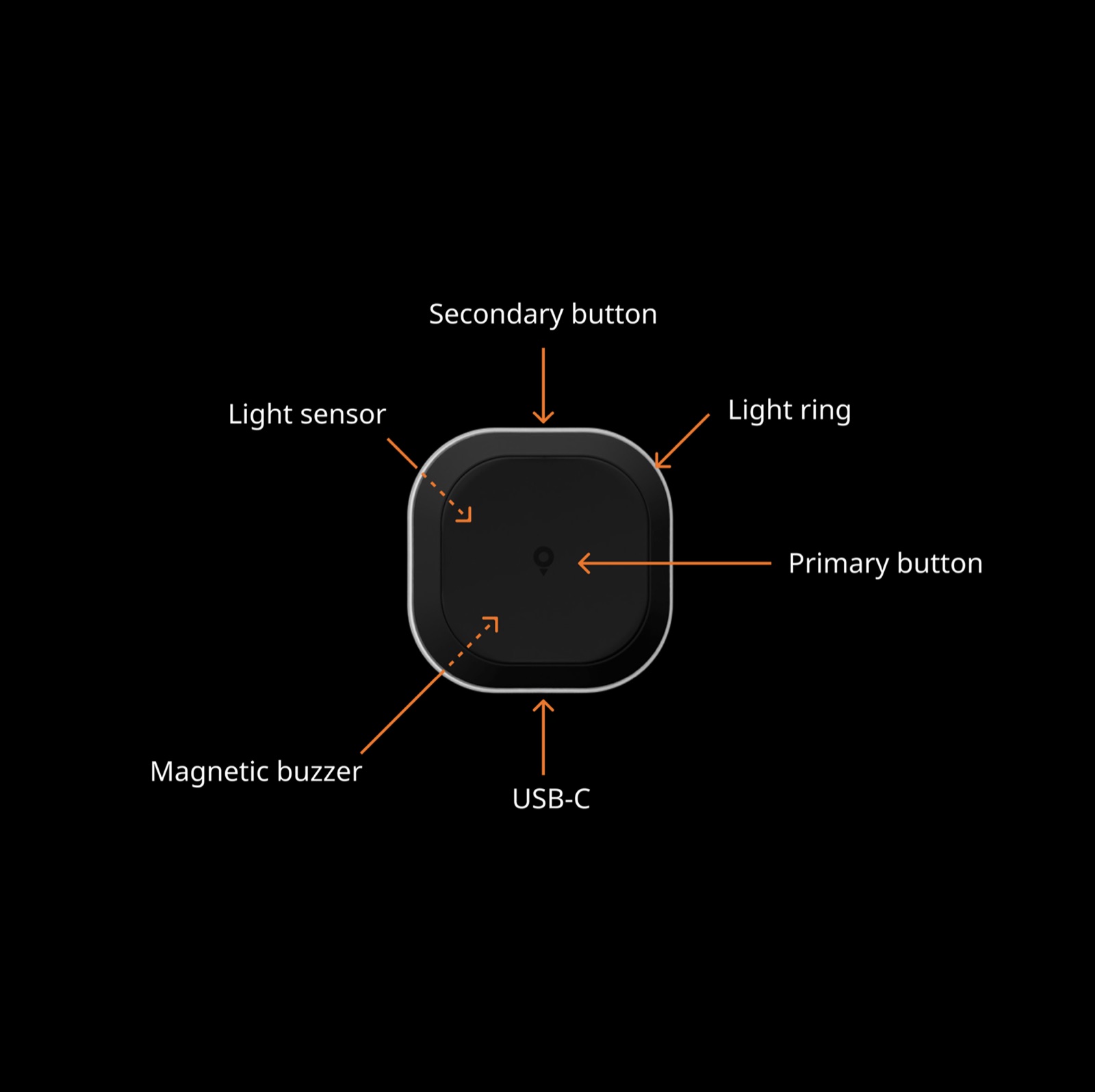
Tom is a small road-alert device with a light ring, a buzzer and no screen. I led its mobile experience inside the TomTom app, from pairing the device to teaching drivers what its signals mean before their first drive.
A device without a screen
Tom warns drivers about speed cameras, hazards and traffic with colour and sound, while the TomTom app supplies the information in the background. I came in for UI work and ended up leading the mobile UX/UI on iOS and Android, while the hardware, firmware, navigation app and design system were all still in development. TomTom launched Tom with the new app on 25 September 2025.
Find it, pair it, see it confirmed
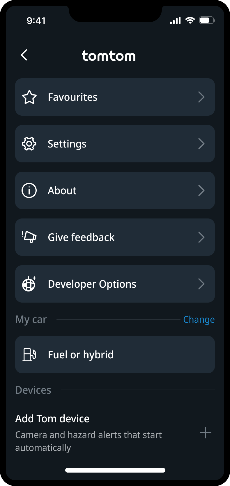
The team considered a separate app. Tom became part of the TomTom app instead, so setup, updates and settings stay easy to find later. I designed a single entry under Devices and one guided flow across the app, the native pairing dialog and the device itself.
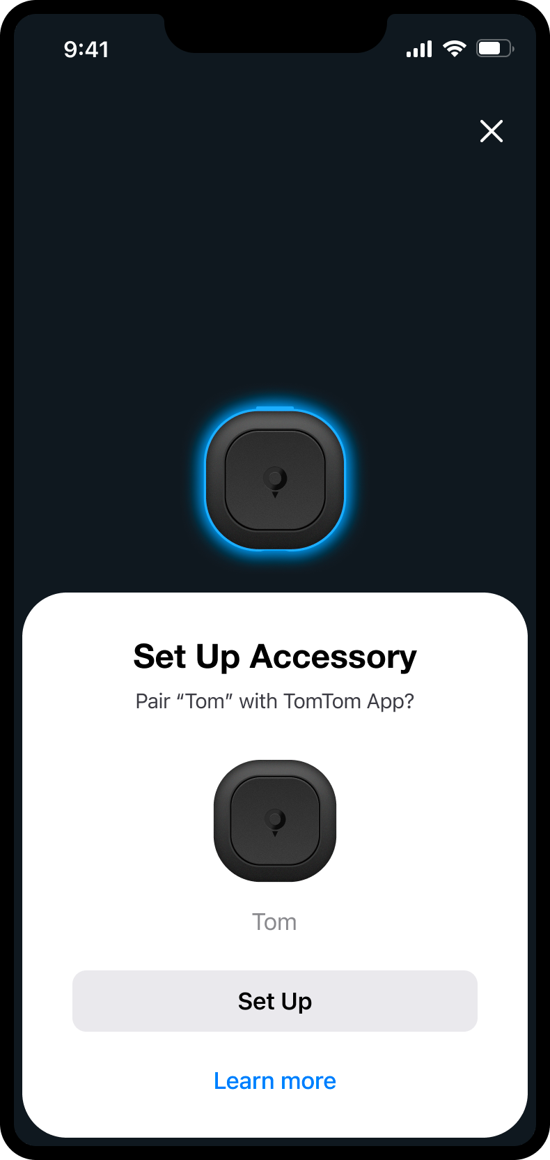
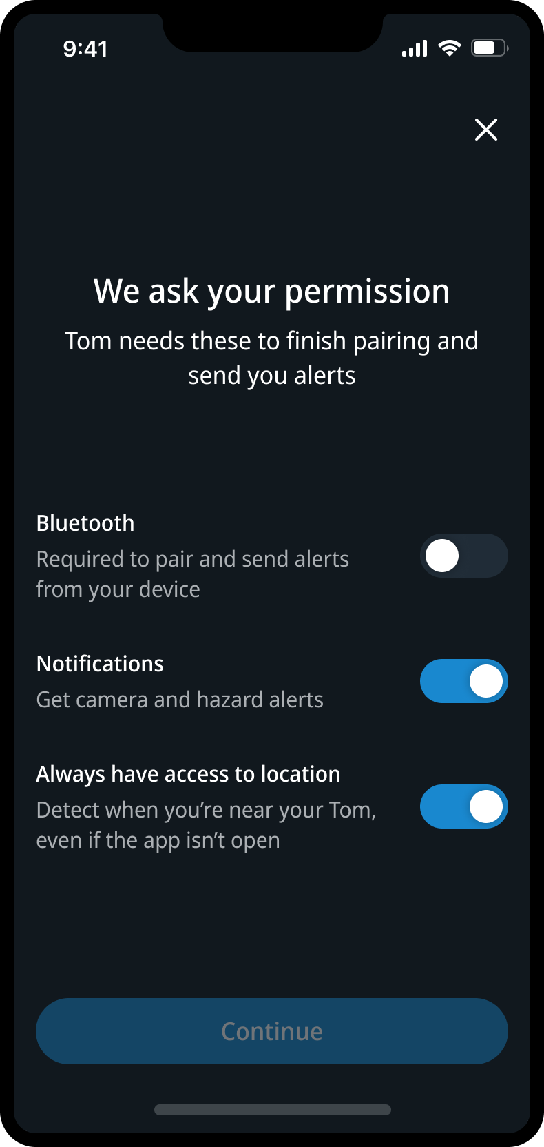
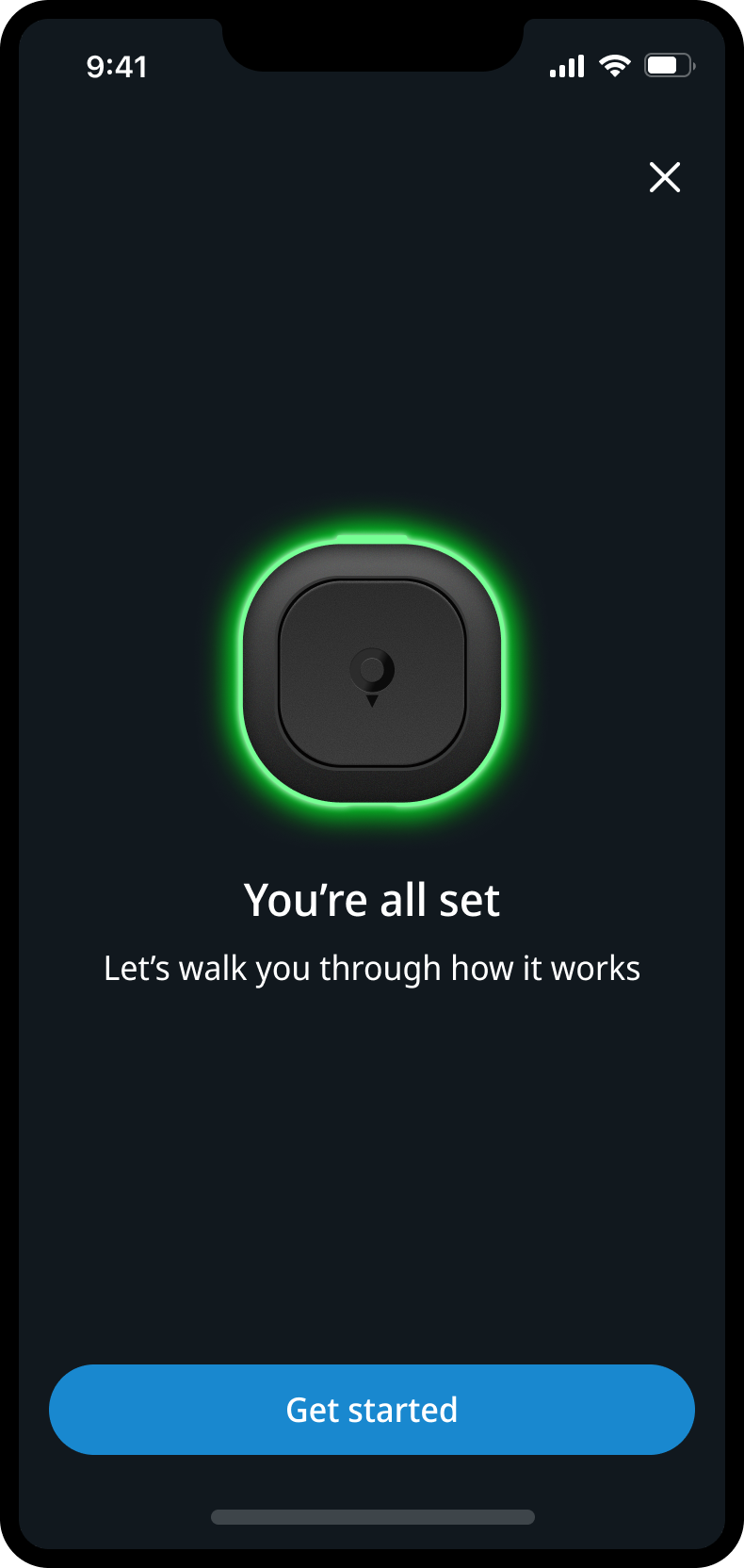
TomTom app · iOS and Android · with recovery paths when pairing fails
Learn one signal before the drive
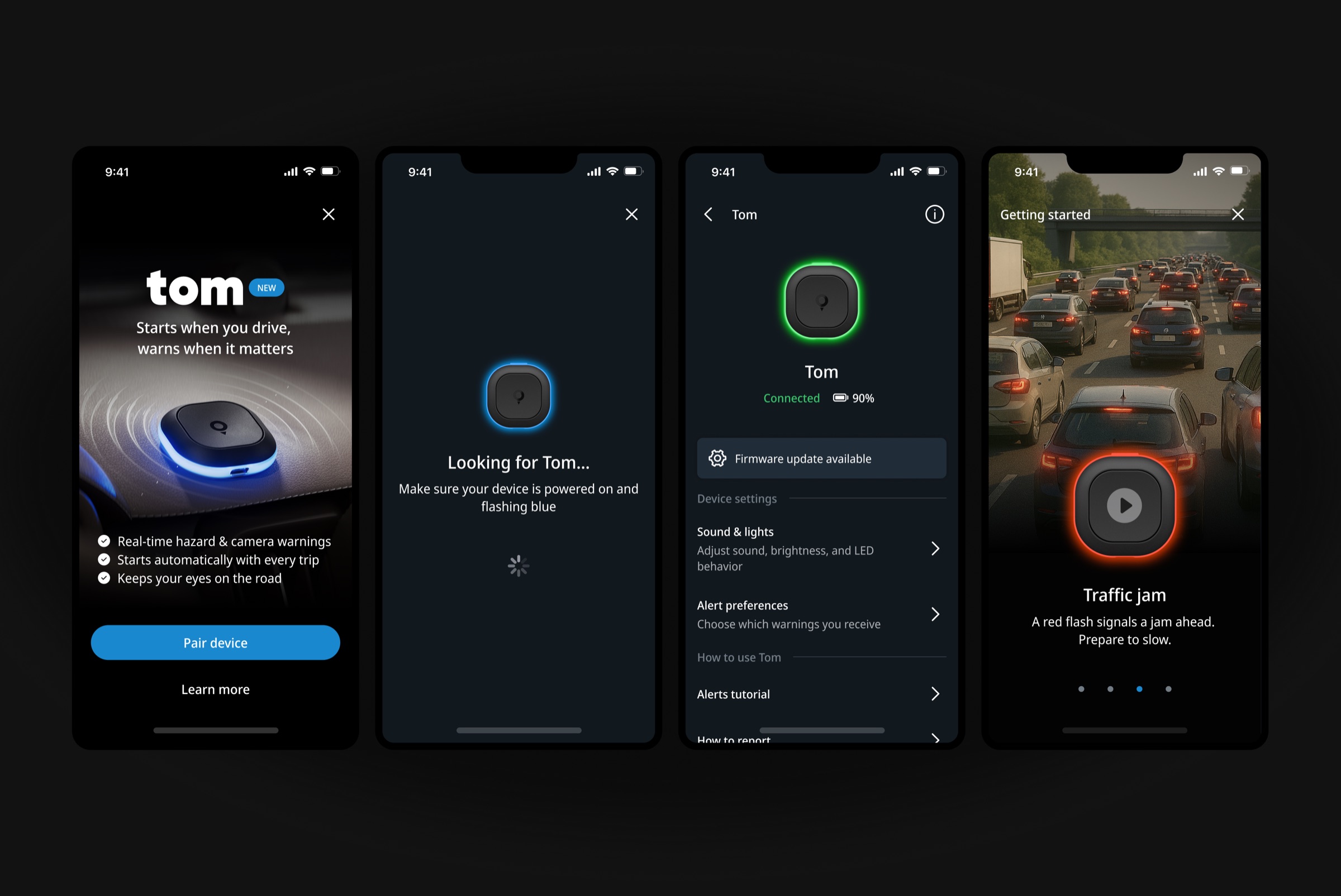
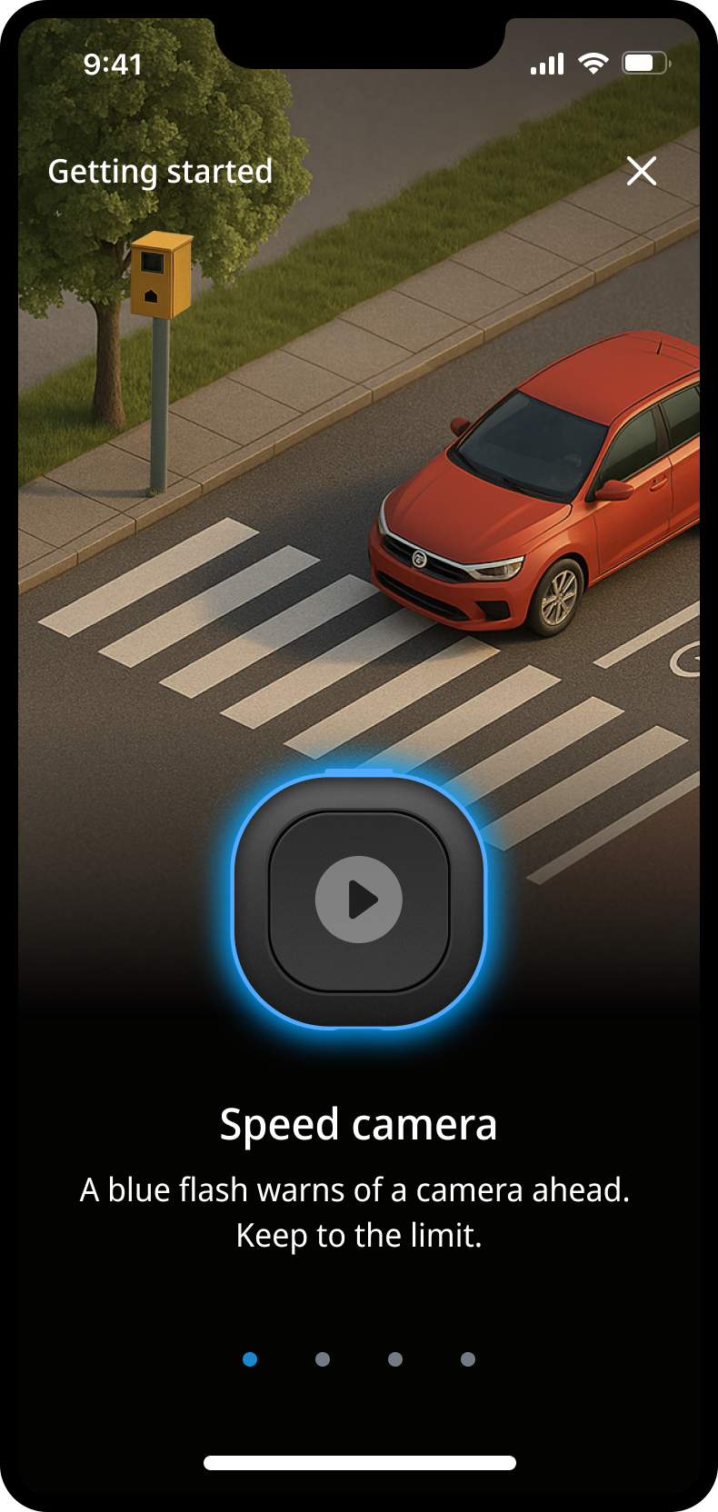
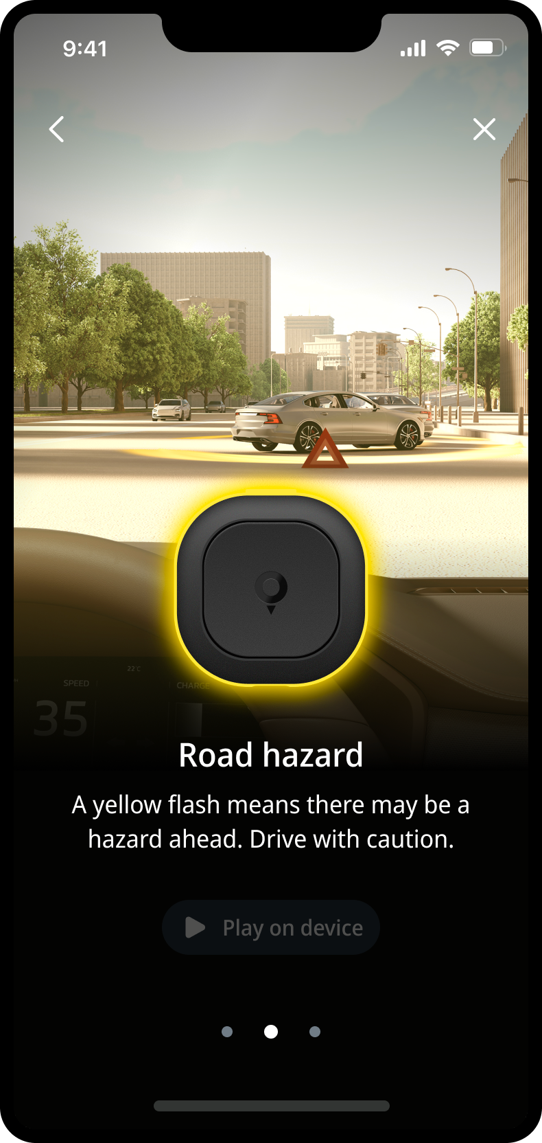
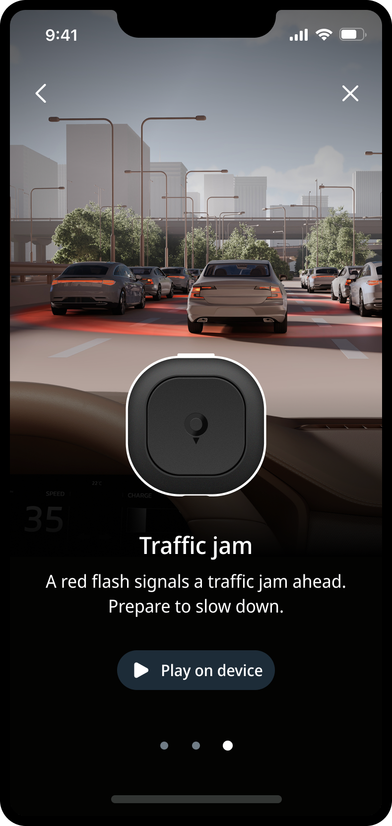
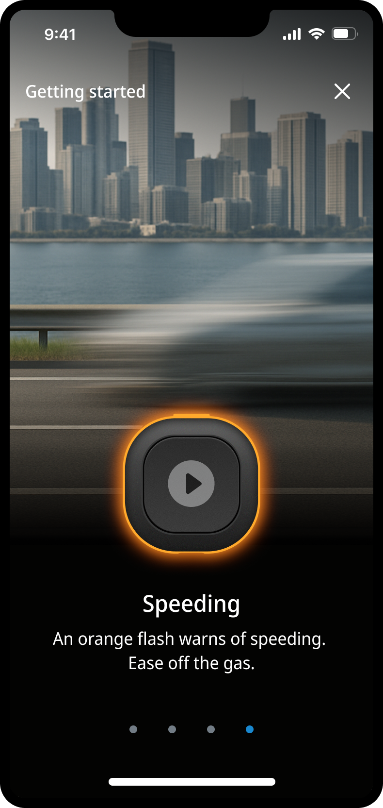
The early tutorial was a list of play buttons: you heard an alert, but not when you would hear it. I turned it into short lessons right after pairing. Each one links a recognisable traffic situation to one line of explanation and plays the real signal on the paired device. AI images helped the team align early; I then worked with an external CGI partner on the final visuals in TomTom’s style.
Settings that explain the device
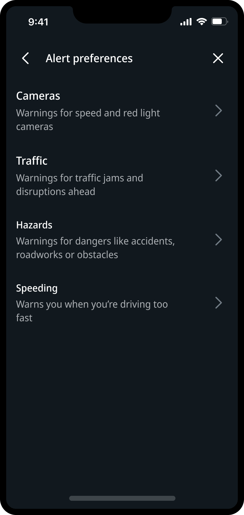
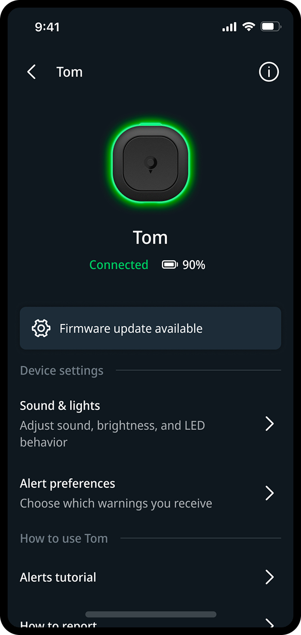
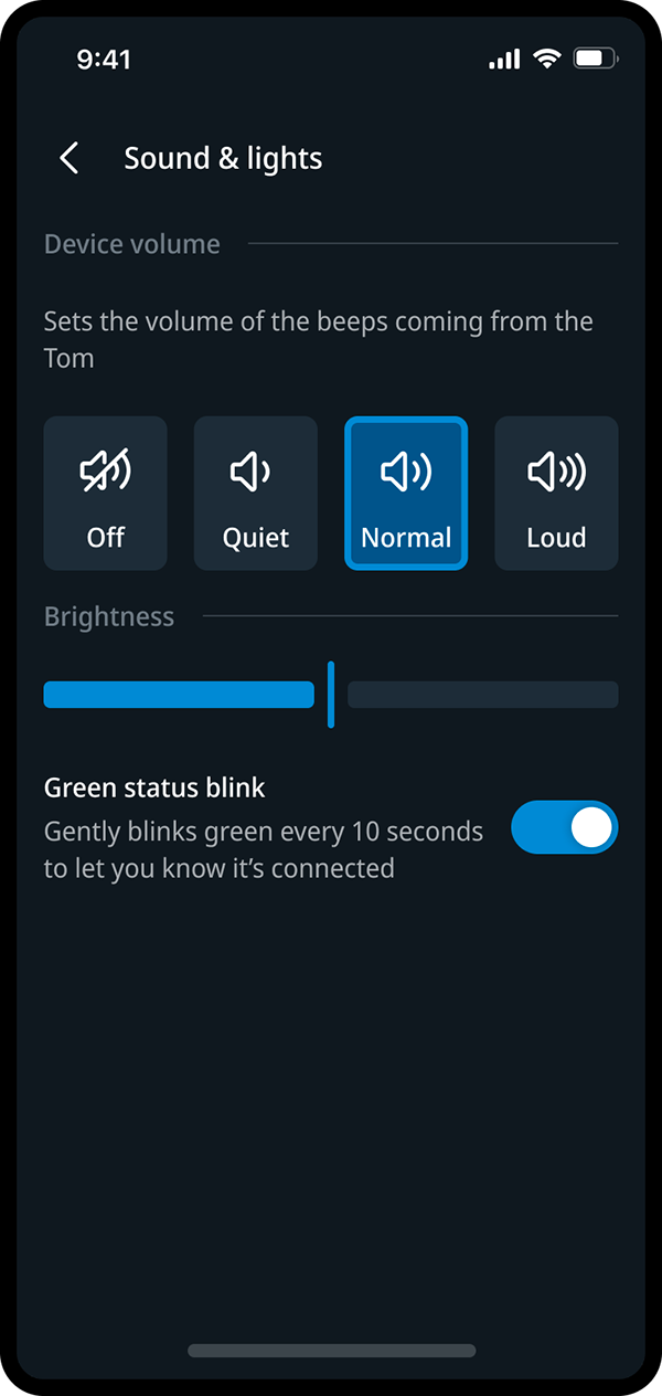
I started on settings early, because they showed what the device could do and how much status the app had to explain. I argued for choosing alerts at a high level: cameras, traffic, hazards and speeding. The subtypes still exist underneath. The device page groups connection, battery and firmware.
Small decisions that keep it calm
A device that talks in colour needs an app that stays quiet. Three choices that kept it that way.
One entry that grows with the owner
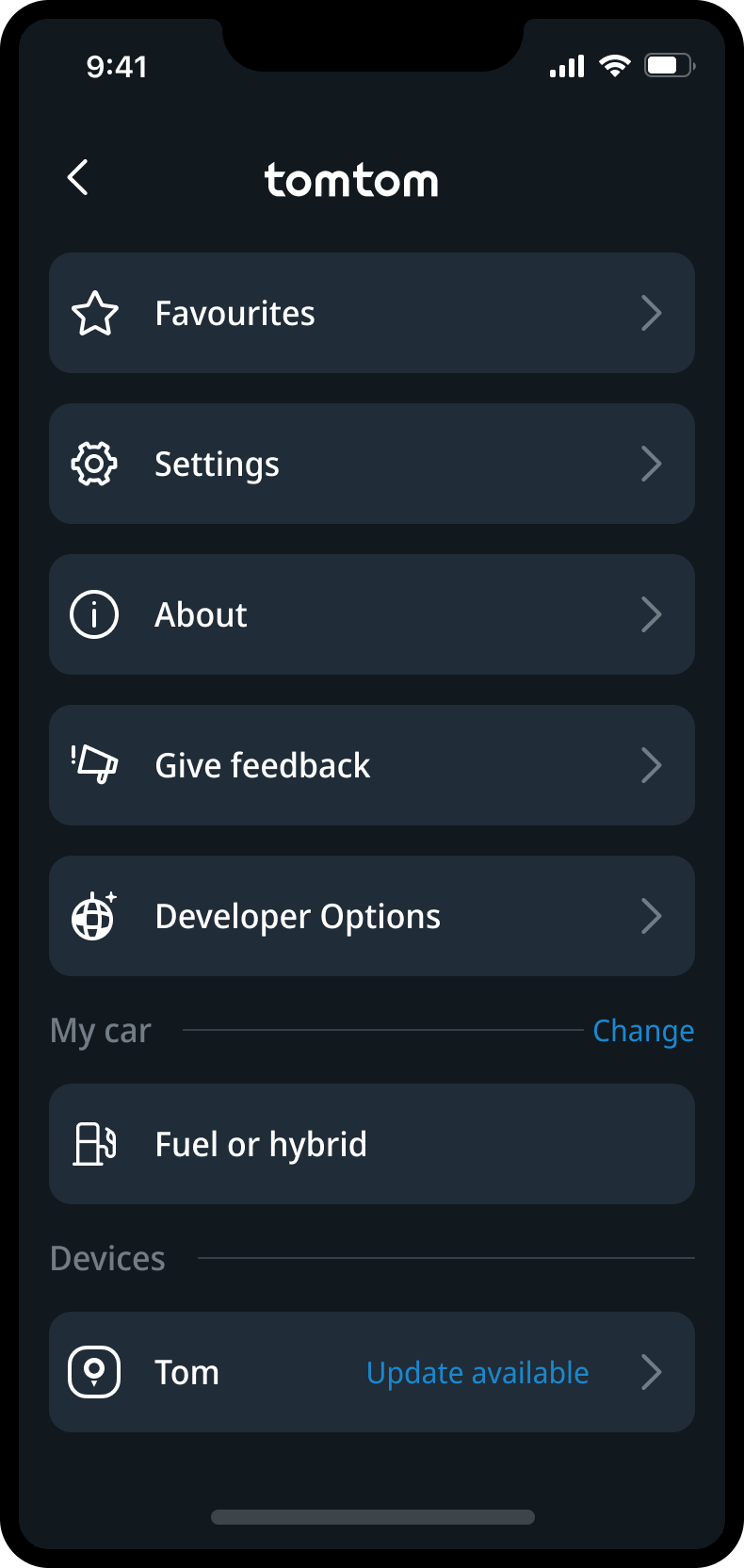
For someone with Tom still in the box, “Add Tom device” is a clear start. After pairing, the same row in the menu leads to your own Tom, and that is where an available update shows up. It leaves room for the navigation features around it.
Speeding stays quiet unless you ask
Each situation has its own colour: blue for cameras, yellow for hazards, red for traffic and orange for speeding. Speeding alerts are off by default, because repeated signals around the limit quickly feel intrusive. The tutorial still teaches the orange signal, so it makes sense when you switch it on.
Rare actions out of the way
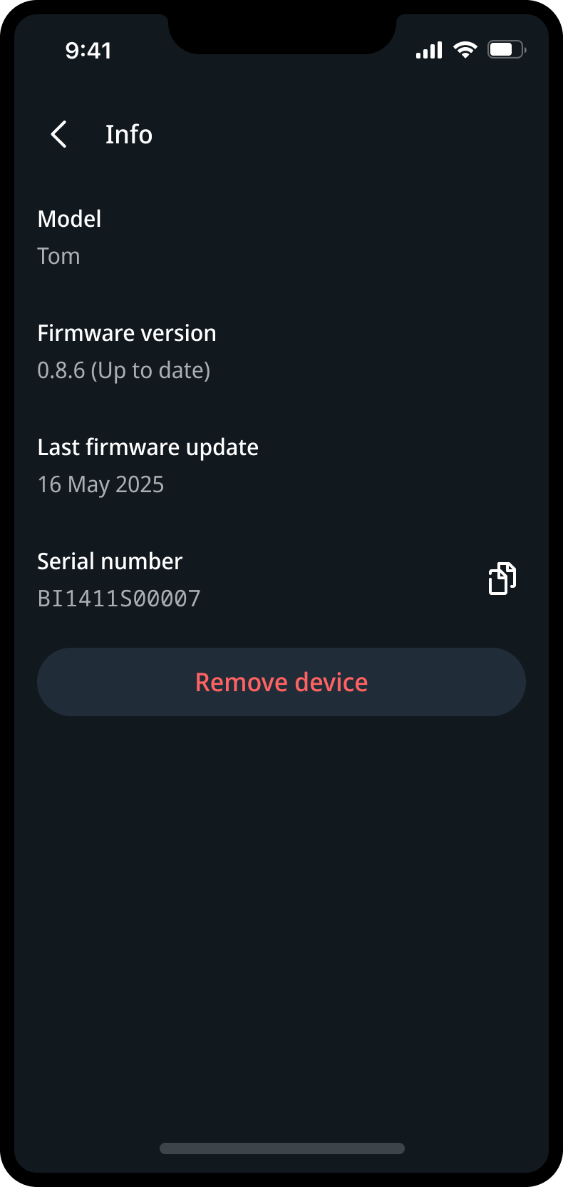
Model, firmware version and the last update are useful when something goes wrong, not every day. They sit under device info, together with removing the device: clear when you look for it, never in the way.
Light, sound and a simulator
I also worked on the light and sound cues, within the limits of the buzzer and the diffuse light ring, and wrote down per scenario the trigger, the intended effect and what the device shows and plays. I built a browser simulator in Cursor that plays each pattern per scenario. The version shown here dates from after the launch and contains in-between versions; the final signals are in the product itself.
More on the light and sound system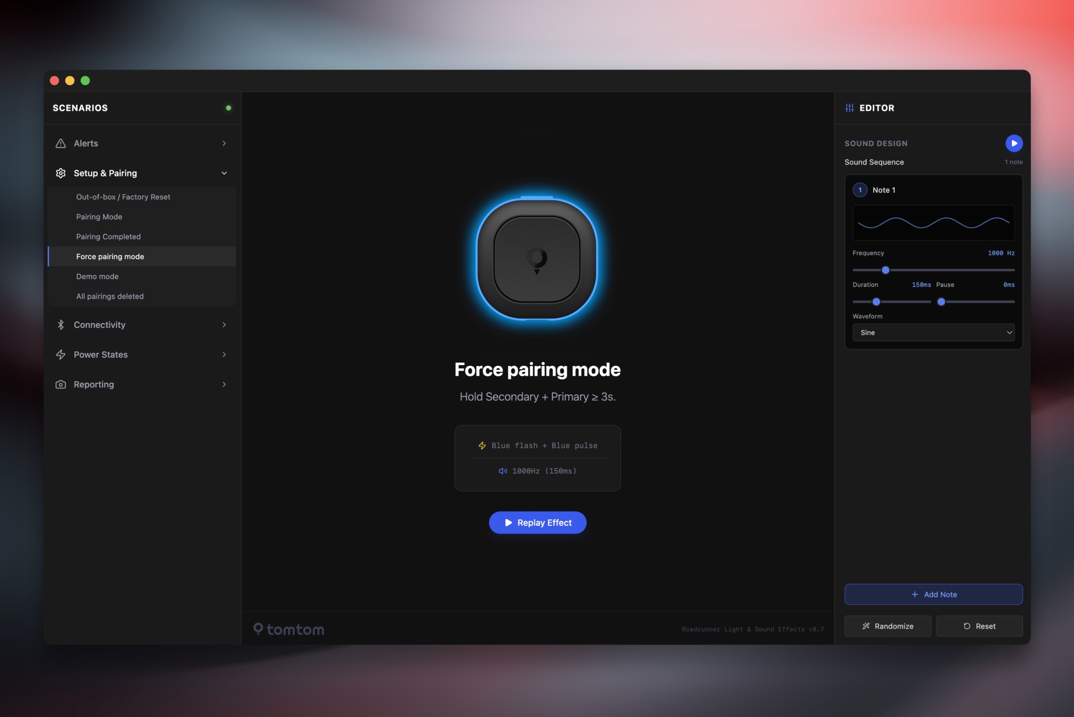
What I delivered
Flows
Onboarding, pairing and the recovery paths for when pairing or permissions fail, across the app, the native dialog and the device.
Screens
Production screens for iOS and Android: product intro, device page, settings, alert preferences and the tutorials.
Behaviour
Light and sound specs per scenario, with trigger, intent and output, and the browser simulator to try them.