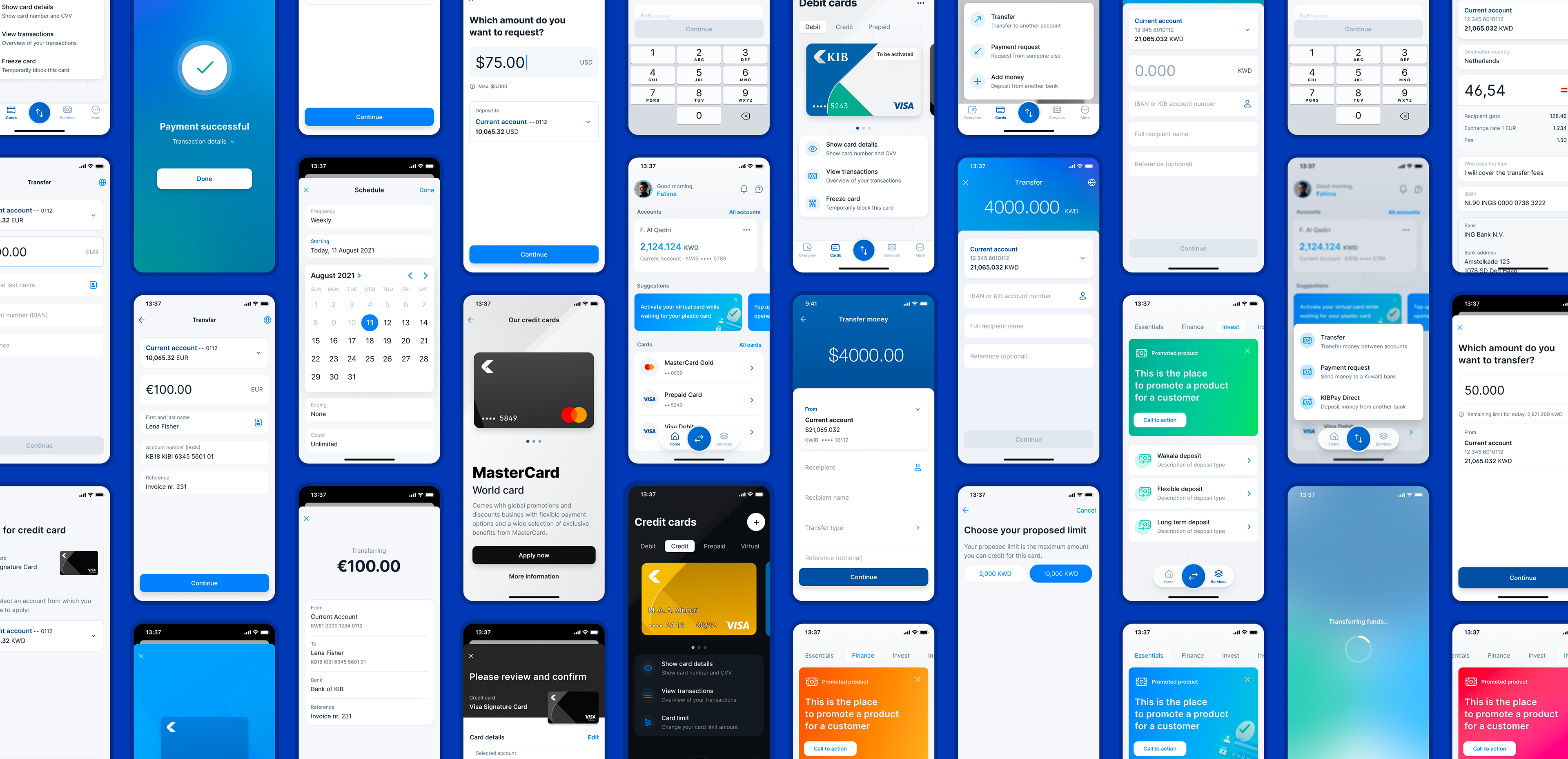
Designing the core payment flows for a new mobile banking app
Type — UX & UI Design
Company — Mobiquity
Role — Senior Product Designer
Year — 2021

The Goal
As a senior product designer at Mobiquity in Amsterdam, I worked on a new mobile banking app for Kuwait International Bank. The product was designed from the ground up, with the ambition to create a modern banking experience for everyday financial tasks.
My focus was the payment ecosystem: domestic transfers, international payments, payment requests, credit-card journeys, and the shared interaction patterns behind them.
The main challenge was to turn complex banking logic into mobile flows that felt simple, trustworthy, and predictable. Users should not need to understand the internal structure of the bank to complete a basic financial task. They want to send money, request money, apply for a card, or confirm that something is safe.
Unified Transfers
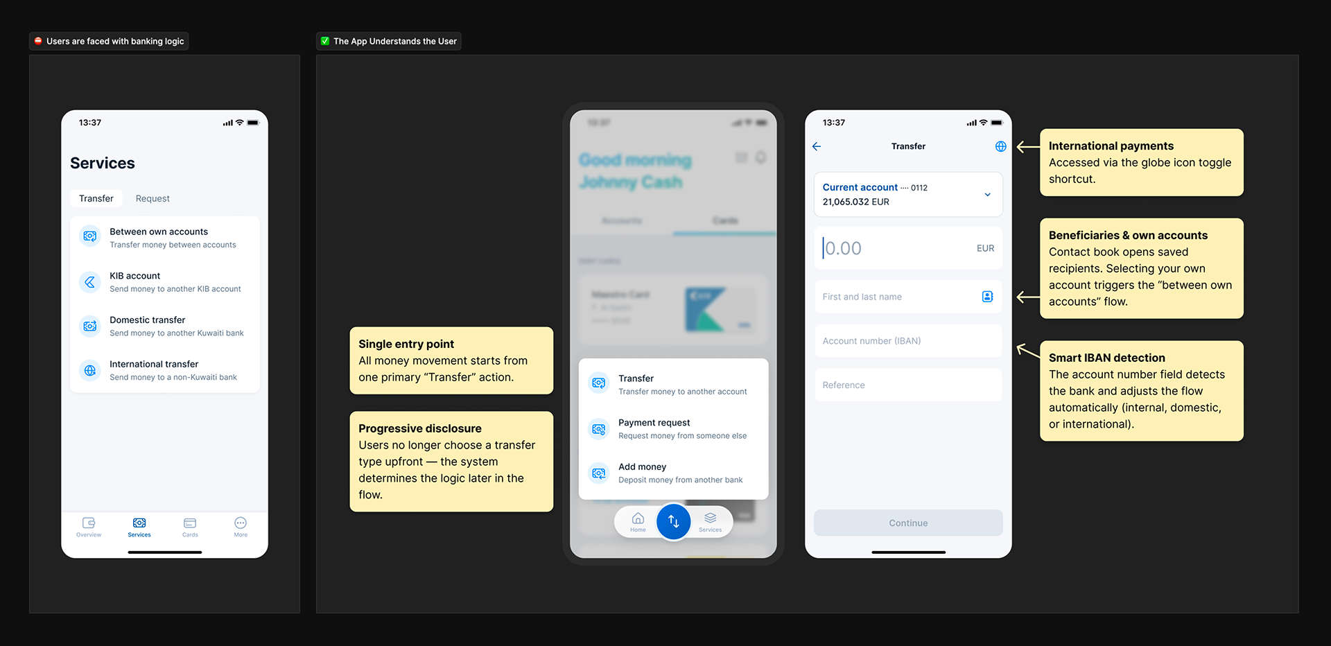
A key design move was simplifying how transfers worked.
Instead of treating domestic, international, internal, and own-account transfers as separate experiences, I helped shape one reusable transfer model. Users start with what they naturally know: the recipient, the amount, and the account they want to use.
From there, the system adapts. It reveals the right fields, rules, fees, exchange rates, and confirmation steps only when needed.
This created a more coherent way to move money, while still supporting the complexity behind the scenes.
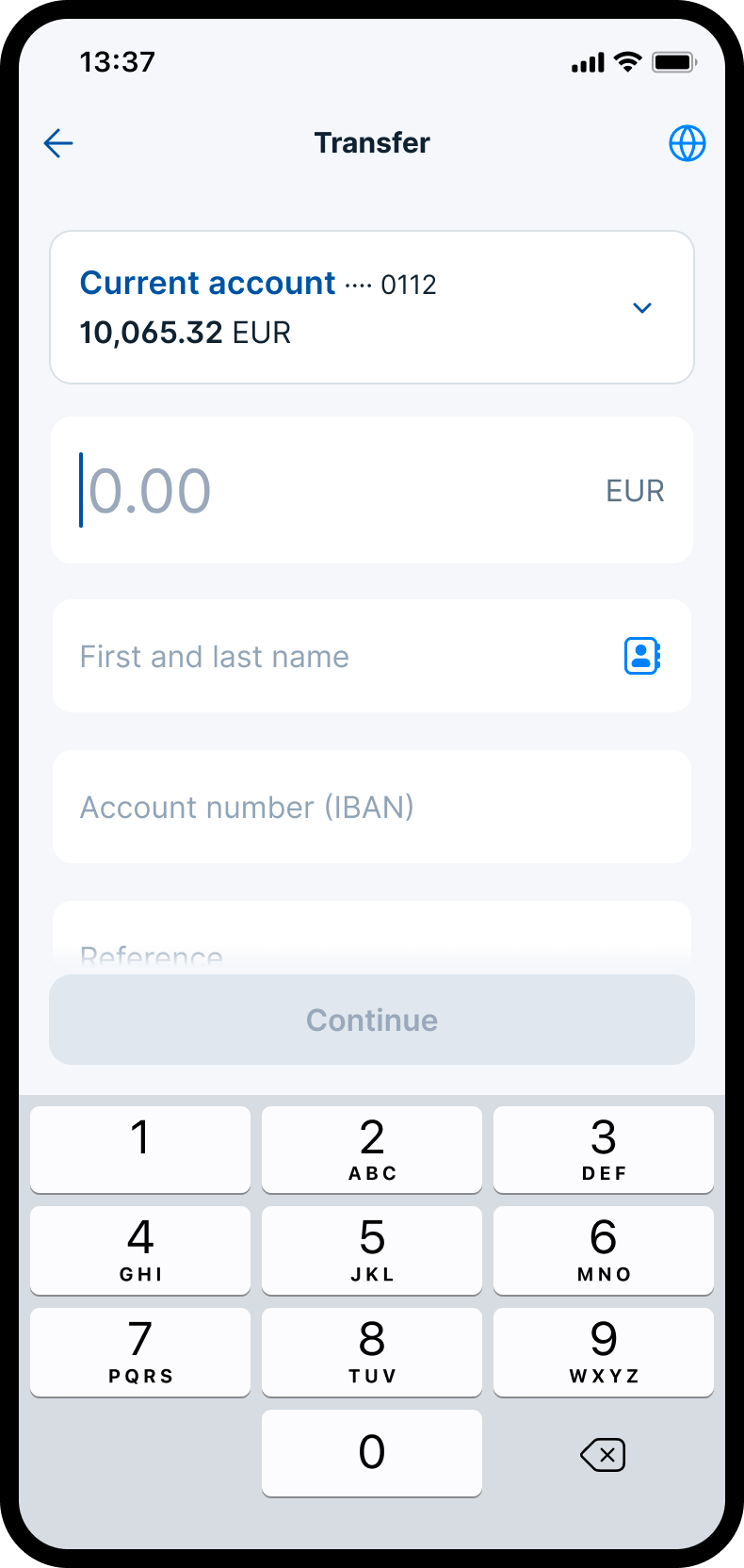
Transfer UI
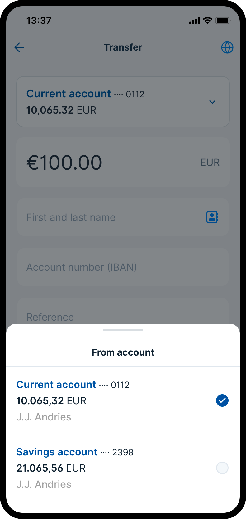
Account selection
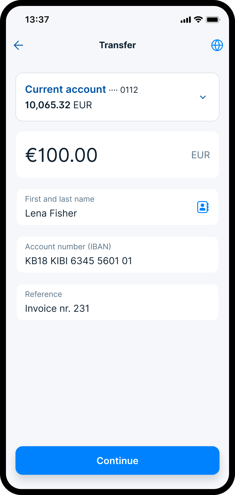
Form completed
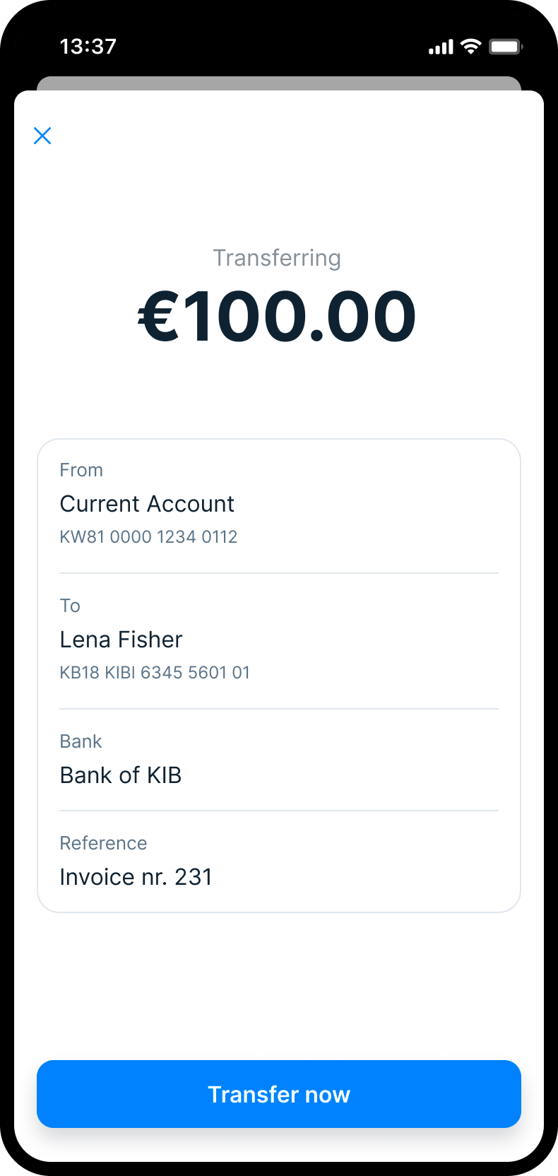
Review
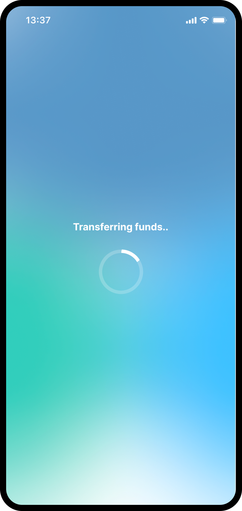
Processing
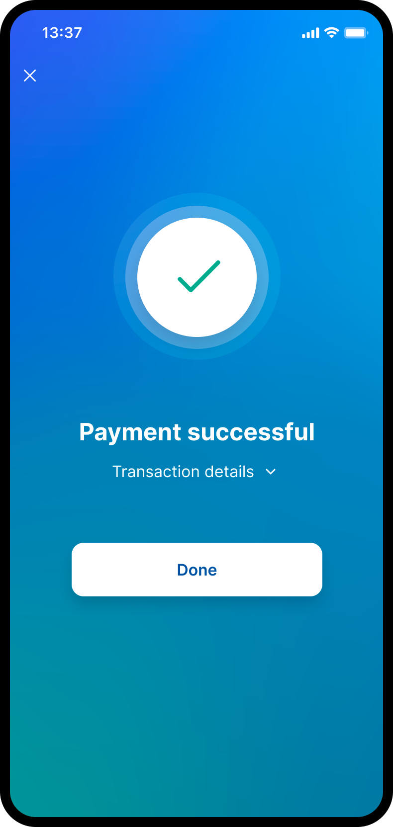
Success
Payments
The interaction model became the foundation for several core payment journeys.
Domestic Payments
Domestic payments formed the baseline. The flow guided users through account selection, amount, recipient, review, confirmation, and feedback. It established the pattern users would learn once and reuse across other payment types.
Payment Requests
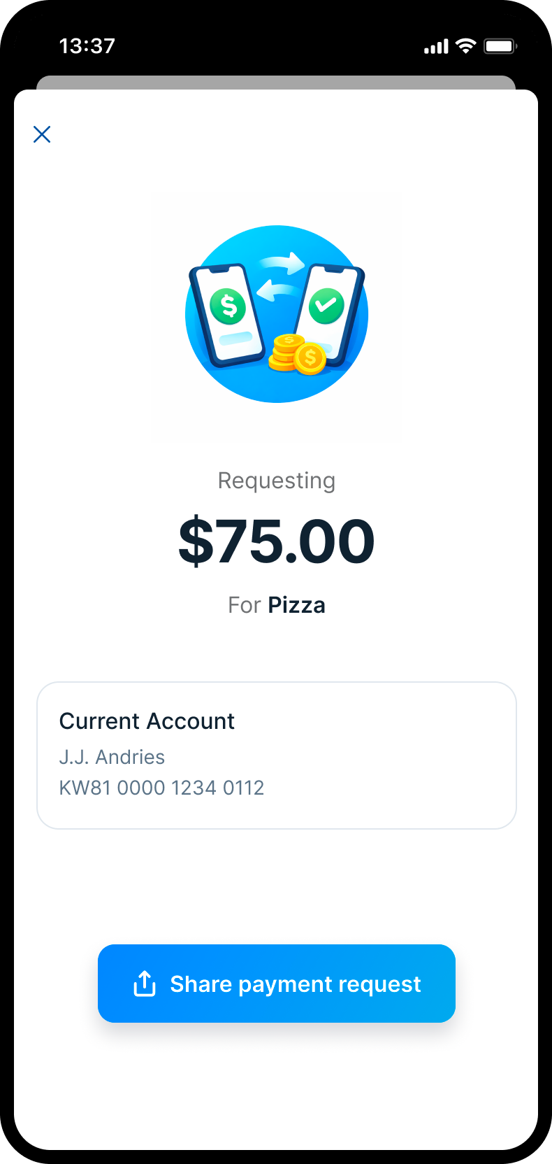
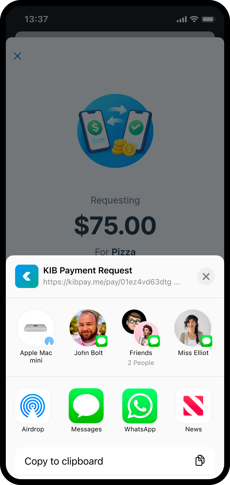
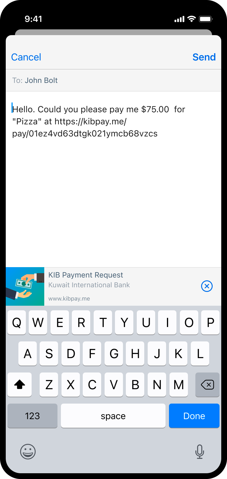
Payment requests offered a lighter, more social way to move money. Users could set an amount, add context, and share a request through familiar messaging channels, without feeling like they were entering a complex banking process.
Credit Cards
Credit-card application and management required a more deliberate flow. I designed the journey to guide users from card exploration to submission, with clear choices, editable review steps, and confirmation moments that helped users stay in control.
International Transfers
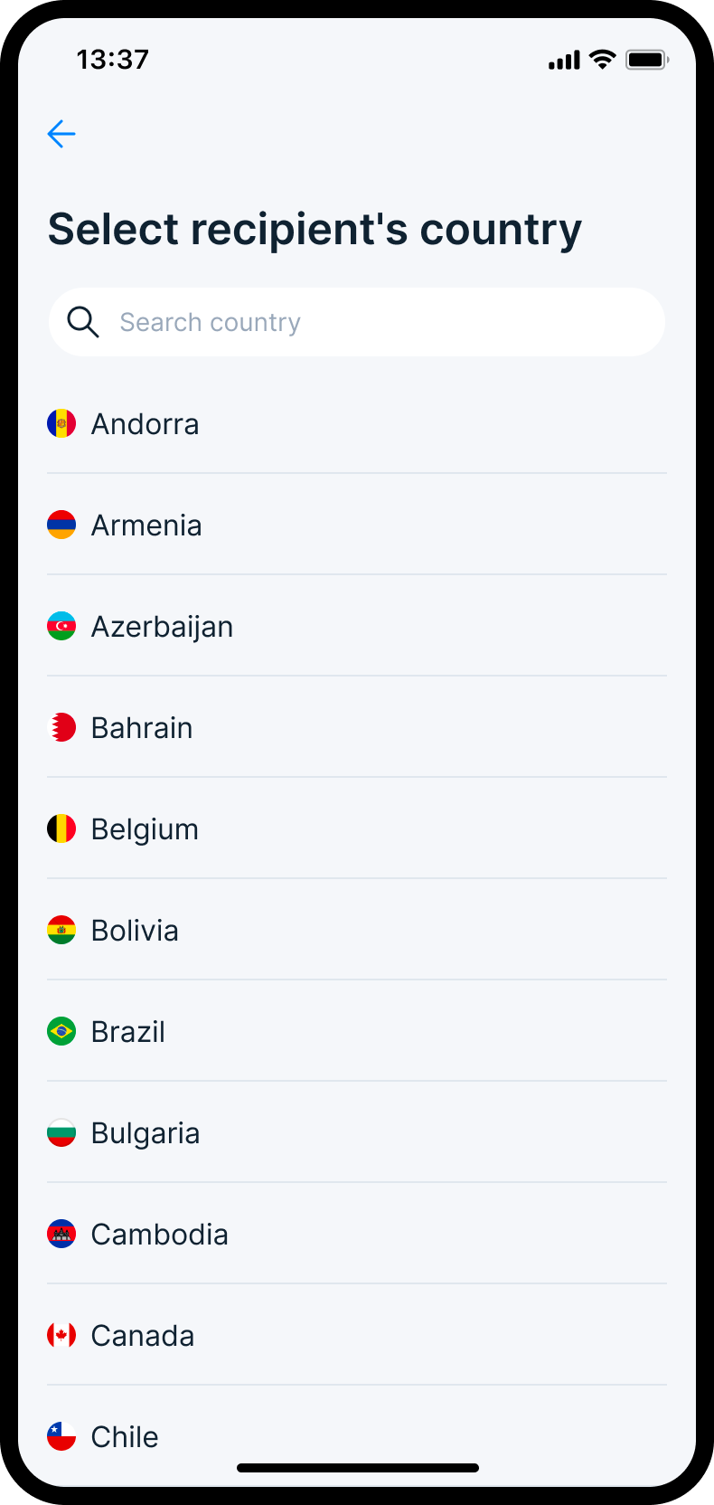
International transfers introduced extra complexity: countries, currencies, exchange rates, fees, and compliance fields. Instead of creating a separate mental model, the same transfer foundation was extended. The experience became more detailed only when the situation required it.
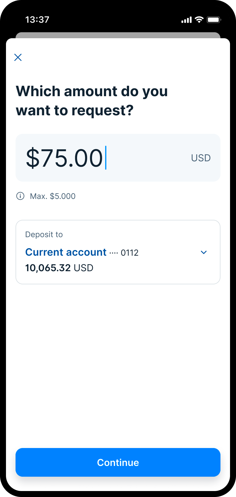
Payment request UI
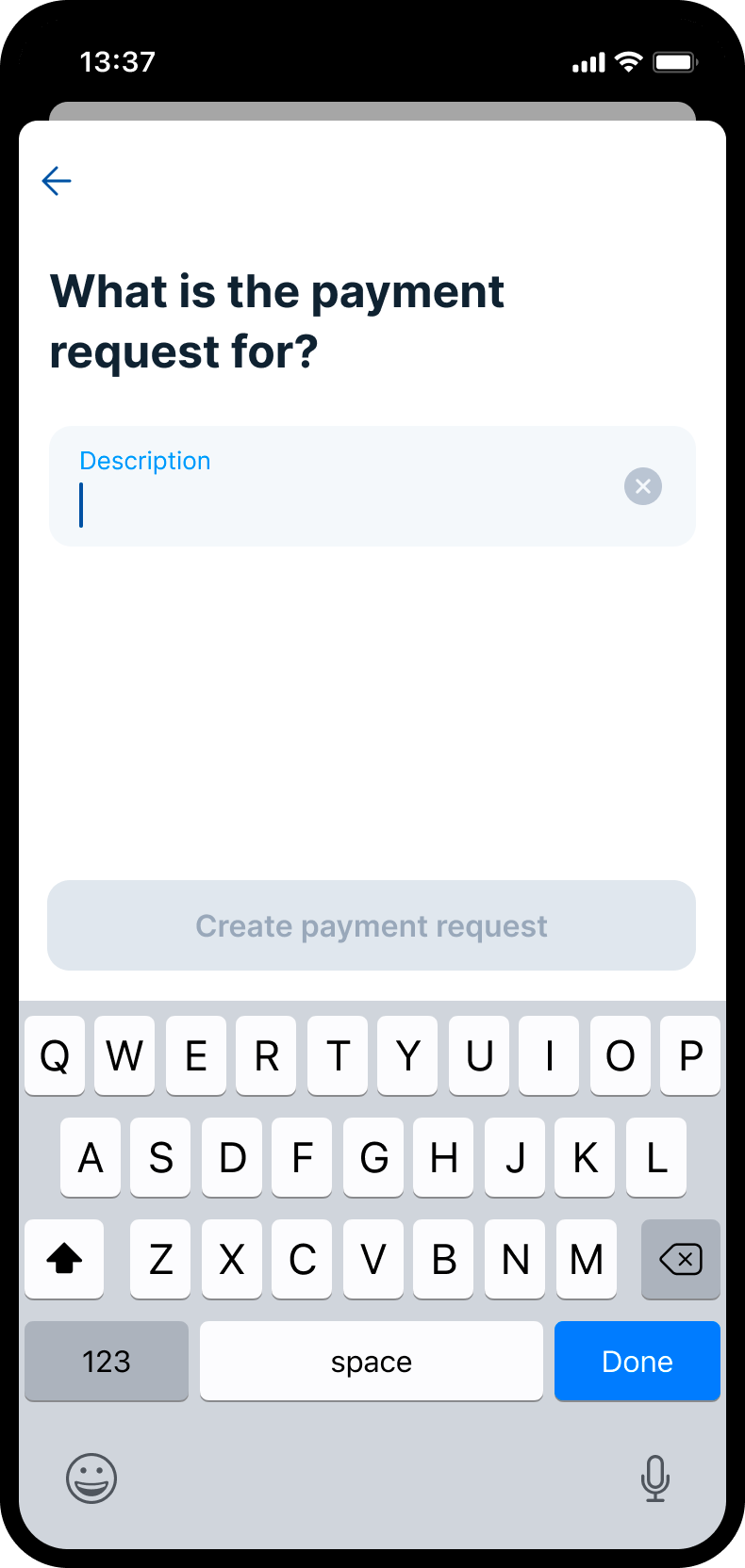
Description
Created + Share
Share modal
Share as message
Requests
Payment requests offered a lighter and more social way to move money.
I designed the experience around a simple intention: create a request, add context, and share it through familiar messaging channels. The flow needed to feel quick and approachable, without losing the trust and clarity expected from a banking product.
The challenge was to make the request feel lightweight, while still making the financial action clear. Users had to understand what they were asking for, who would receive it, and what would happen after the request was shared or paid.
Recipient country
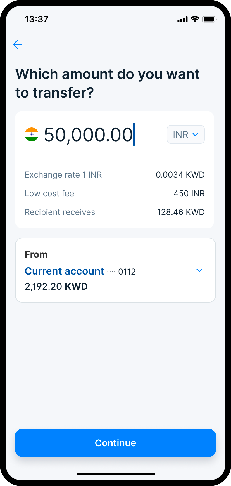
Amount & conversion (India flow)
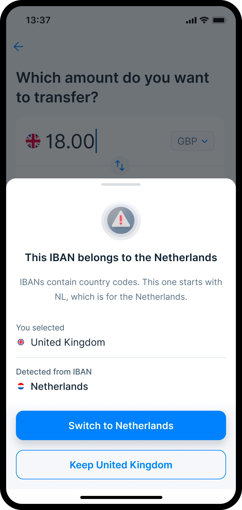
IBAN discrepancy
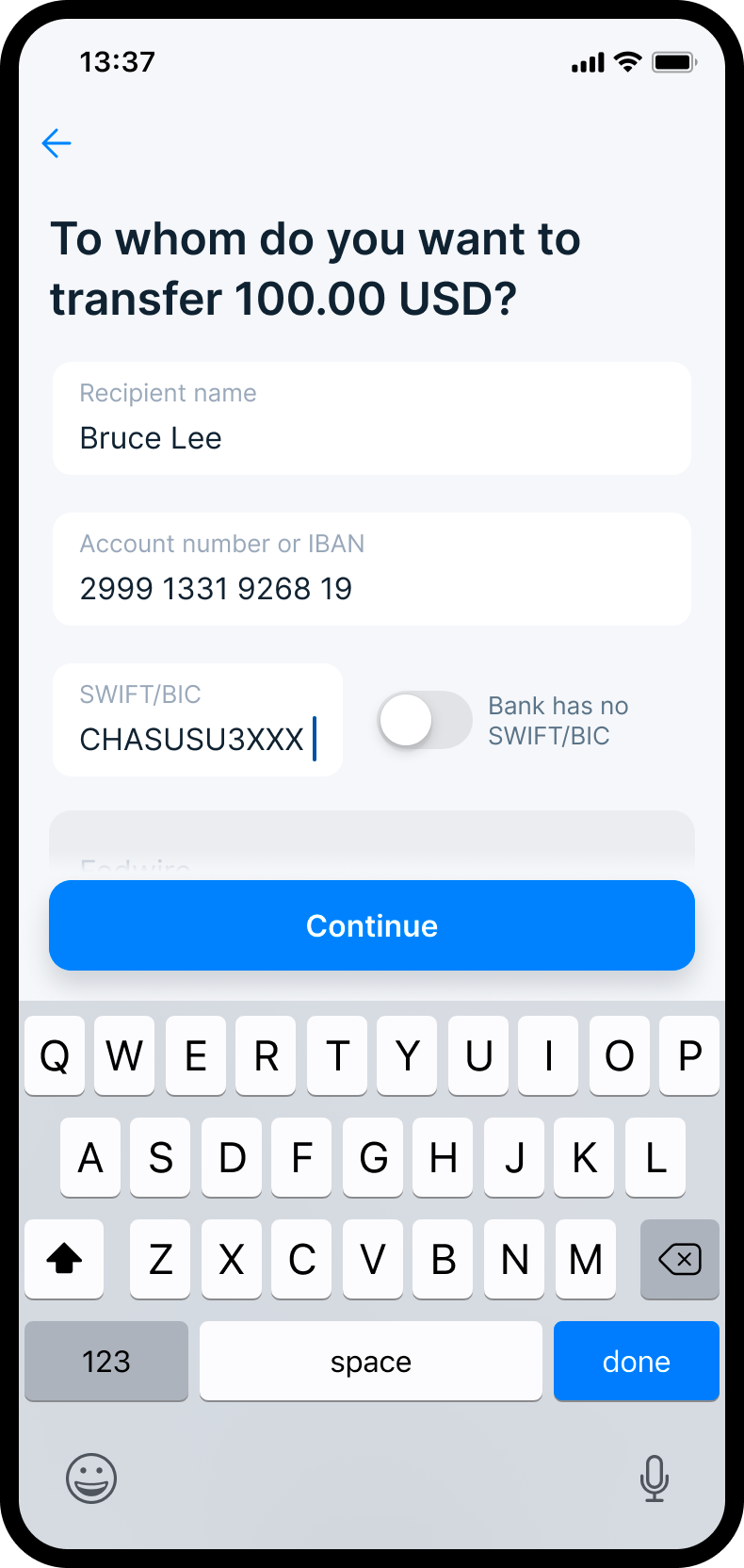
Case: USA
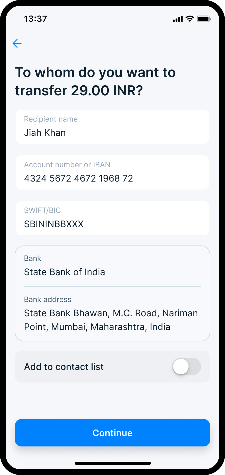
Case: India
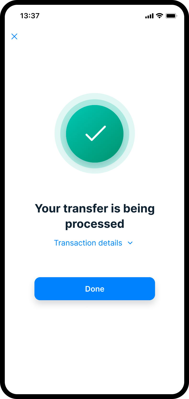
Success
Team & Role
I worked in a large multidisciplinary setup with product, business analysis, Android, iOS, QA, solution architecture, leadership, and several design peers across onboarding, personal finance and accounts.
My role was to bring focus to the payments domain. I owned the core payment-related flows, helped connect product requirements with technical constraints, and aligned the squad around shared interaction patterns instead of fragmented one-off solutions.
Because the product was being built from the ground up, the work was not only about designing individual screens. It was also about helping establish foundations: how flows were structured, how review and confirmation moments behaved, how payment journeys reused familiar patterns, and how design decisions could scale across the app.